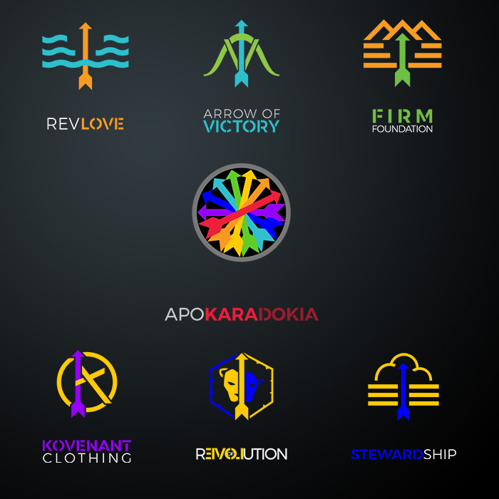
Developing the branding for Apokaradokia, LLC has been one of the most well rounded projects I have been a part of. It encompassed a full branding package for 7 companies, everything from logo and stationary to digital presence
Part of the challenge was to interpret some of the less literal logos into something cohesive and that still felt like part of the family of companies (i.e. Kovenant, a clothing line, sharing space with Arrow of Victory an LLC registrar). The solution was to use arrows as an element to tie all the logos together, they also use a two tone approach in which each logo shares a color with at least one other logo of the family.